14 Beautiful Paint Colors for Compact Homes
Choosing the Best Paint Colors for Small Rooms is one of the easiest and most affordable ways to transform a compact home. Whether you’re decorating a tiny apartment, a cozy bedroom, or a narrow living room, the right wall color can dramatically improve visual space, brighten dark corners, and make your home feel larger without knocking down a single wall. Modern Interior Design isn’t just about selecting trendy shades—it’s about understanding how color psychology, light reflection, paint undertones, and the right paint finish work together to enhance room proportions.
Why Paint Color Matters in Small Spaces
Paint is one of the most powerful design tools available. Unlike expensive renovations, the right color can instantly change how a room looks and feels. Professional designers often rely on strategic paint choices to improve visual depth, enhance light reflection, and create the illusion of larger compact spaces. That’s why selecting the Best Paint Colors for Small Rooms involves much more than simply choosing your favorite shade—it requires understanding how color interacts with light, furniture, finishes, and the architecture of your home.
How Color Affects Room Size
Color has a remarkable ability to influence how we perceive space. Lighter shades naturally reflect more light, making walls appear farther apart and helping rooms feel brighter and more open. This is why soft whites, warm creams, pale grays, and muted blues consistently rank among the Paint Colors That Make a Room Look Bigger.
Darker colors work differently. Instead of reflecting light, they create visual depth, allowing certain walls to recede when used strategically. Deep navy, charcoal, olive green, and even black can add sophistication without shrinking a room—especially when paired with lighter ceilings, mirrors, and balanced lighting.
The way paint is applied also matters. Techniques like painting the Ceiling Paint a lighter shade, using coordinated Wall Trim, or incorporating a carefully placed Accent Wall can subtly improve room proportions while maintaining a cohesive flow throughout the home.
The Psychology of Light and Dark Colors
Every paint color creates an emotional response, making color psychology an essential part of successful Interior Design.
Light colors such as soft white, cream, pale sage, and fresh blue create feelings of openness, cleanliness, and calm. They maximize reflected light and contribute to airy, welcoming interiors that suit modern apartments and compact homes.
Warm colors—including warm ochre, earthy terracotta, and muted beige—introduce comfort and coziness without making a room feel confined. These shades are particularly effective in rooms with limited sunlight because they naturally compensate for cooler lighting conditions.
Meanwhile, darker colors like navy blue, olive green, charcoal, and black bring elegance, intimacy, and drama. Used thoughtfully on a single feature wall or built-in cabinetry, they create striking contrast while enhancing visual interest rather than reducing space.
Understanding these emotional effects allows you to choose Small Room Paint Colors that not only improve appearance but also support the mood you want each room to create.
Why Paint Is Better Than Major Renovations
Many homeowners assume that making a small room feel larger requires removing walls or investing in expensive remodeling projects. In reality, paint delivers one of the highest returns on investment in Home Decor.
A fresh coat of quality interior paint can:
- Instantly brighten dark rooms.
- Improve perceived room size.
- Refresh outdated interiors.
- Highlight architectural details.
- Modernize existing décor.
- Complement current furniture and accessories.
- Create a dramatic room makeover at a fraction of renovation costs.
Simple updates like repainting walls, refreshing Wall Trim, updating Ceiling Paint, or introducing an elegant Accent Wall often produce transformations that rival much more expensive renovations.
How to Choose the Right Paint Color for a Small Room
Selecting the perfect paint involves much more than choosing a color you like. Lighting, orientation, finishes, and existing furnishings all influence how paint appears after it’s applied. Understanding these factors helps you choose Wall Colors for Small Rooms that remain beautiful throughout the day and continue to complement your home for years to come.
Consider Natural Light
The amount of Natural Light entering your room is one of the biggest factors affecting paint color.
Bright, sun-filled rooms can handle cooler neutrals, soft grays, pale blues, and even darker shades because abundant sunlight prevents them from feeling heavy. Rooms with limited daylight usually benefit from warmer paint colors like cream, warm beige, soft taupe, or muted terracotta that reflect available light more effectively.
Artificial lighting also influences appearance. Warm LED bulbs emphasize creamy undertones, while cooler bulbs may make whites and grays appear slightly blue.
Designer Tip: Always observe paint samples during morning, afternoon, and evening light before making your final choice.
Understand Room Orientation
The direction your room faces significantly changes how paint colors appear.
- North-facing rooms receive cooler light, making warm whites, cream tones, and warm greige excellent choices.
- South-facing rooms enjoy abundant sunlight and work well with both warm and cool paint colors.
- East-facing rooms appear warmer in the morning and cooler later in the day.
- West-facing rooms become warmer during the afternoon and evening, enhancing earthy and golden tones.
Understanding room orientation helps prevent unpleasant surprises and ensures your chosen paint complements your home’s natural lighting conditions.
Choose the Right Paint Finish
Selecting the correct paint finish is just as important as choosing the color itself.
- Matte Paint creates a smooth, elegant appearance and hides wall imperfections.
- Eggshell Finish offers a subtle sheen with excellent versatility for most living spaces.
- Satin Finish provides additional durability, making it ideal for kitchens, bathrooms, and high-traffic areas.
- Gloss Paint reflects the most light and works best on doors, cabinets, trim, and decorative features rather than entire walls.
The right finish enhances light reflection, durability, and the overall quality of your interior styling while supporting the chosen color palette.
Match Your Existing Decor
Even the most beautiful paint color can look out of place if it clashes with your furniture or finishes. Before selecting a new shade, evaluate your existing flooring, countertops, cabinetry, upholstery, rugs, and decorative accessories.
Warm wood floors pair beautifully with cream walls, earthy terracotta, olive green, and warm ochre. Gray flooring often complements soft whites, sage green, navy blue, and greige. Modern interiors featuring black accents and minimalist furniture can accommodate stronger color contrasts, while traditional homes often benefit from softer neutral palettes.
Rather than choosing paint in isolation, build a cohesive color palette that complements your entire room. Coordinating your walls with your furnishings creates balanced home styling, improves visual space, and ensures your compact home feels intentional, elegant, and welcoming.
14 Beautiful Paint Colors for Compact Homes
The right color can completely change the way a room feels. While furniture placement and lighting are important, choosing the Best Paint Colors for Small Rooms is often the biggest factor in making compact interiors appear larger, brighter, and more welcoming. Light-reflective shades improve visual space, while carefully selected undertones create warmth, depth, and balance. Below are six designer-approved light and neutral colors that consistently rank among the best Paint Colors for Small Spaces because they maximize brightness without sacrificing style.
Soft White
Soft White remains the gold standard when it comes to Paint Colors That Make a Room Look Bigger. Unlike stark bright white, soft white contains subtle warm undertones that create a welcoming atmosphere while reflecting plenty of light. It’s incredibly versatile and complements nearly every Interior Design style, from Scandinavian Style to contemporary minimalism.
Why It Works
Soft white reflects both Natural Light and artificial lighting exceptionally well, helping walls visually recede and making compact spaces feel open. It also provides a clean backdrop that allows furniture, artwork, and architectural details to stand out. Because its undertones are softer than pure white, the room feels bright without appearing cold or clinical.
Best Room
- Living room
- Small bedroom
- Hallway
- Studio apartment
- Home office
Lighting Tips
Soft white performs beautifully in rooms with both abundant sunlight and limited daylight. Pair it with warm LED lighting to maintain a comfortable, inviting glow during the evening.
Matching Décor
Combine soft white walls with natural oak furniture, linen curtains, woven baskets, black accents, and textured rugs. Cream fabrics and indoor plants further enhance the airy atmosphere while creating balanced home styling.
Designer Tip
Paint both the Ceiling Paint and Wall Trim in matching soft white for a seamless appearance that visually increases ceiling height and enhances room proportions.
Warm Cream
Warm Cream offers all the brightness of white with noticeably more warmth and character. It’s one of the most timeless Small Room Paint Colors because it softens interiors while maintaining an open, spacious feel.
Why It Works
Cream walls reflect light gently while introducing warmth that makes compact spaces feel comfortable instead of sterile. This shade works particularly well in homes with limited sunlight because its warm undertones compensate for cooler lighting conditions.
Best Room
- Bedroom
- Living room
- Dining room
- Small apartment
- Guest room
Lighting Tips
Warm cream thrives in north-facing rooms where natural light is cooler. Use layered lighting with warm bulbs to emphasize its cozy appearance.
Matching Décor
Pair warm cream with beige upholstery, brass hardware, warm wood furniture, natural fiber rugs, and soft white accessories for elegant interior styling.
Designer Tip
Choose an Eggshell Finish to gently enhance light reflection while maintaining a sophisticated appearance that’s easy to clean.
Light Greige
Light Greige combines gray and beige into one beautifully balanced neutral, making it one of today’s most popular Wall Colors for Small Rooms.
Why It Works
Greige delivers the versatility of gray without feeling cold. Its balanced undertones adapt well to changing light throughout the day while providing subtle depth that enhances visual space. It’s an excellent choice for homeowners seeking modern elegance.
Best Room
- Dining room
- Living room
- Bedroom
- Home office
- Entryway
Lighting Tips
Greige performs best in rooms receiving moderate to abundant Natural Light. In darker rooms, choose a warmer greige to prevent the space from feeling dull.
Matching Décor
Complement greige walls with charcoal accents, white trim, black lighting fixtures, oak furniture, textured fabrics, and greenery for a refined Modern Interior Design aesthetic.
Designer Tip
Add a navy or charcoal Accent Wall if you want extra depth without making the room feel smaller.
Soft Beige
Soft Beige has remained one of the most dependable neutral wall colors because it creates warmth, flexibility, and timeless appeal.
Why It Works
Beige reflects light while introducing subtle earthy undertones that create comfortable, welcoming interiors. It works beautifully with both traditional and contemporary decorating styles, making it one of the safest choices for a room makeover.
Best Room
- Family room
- Bedroom
- Hallway
- Dining room
- Small living room
Lighting Tips
Soft beige works well under both natural sunlight and artificial lighting. In rooms with limited windows, warm white bulbs help preserve its inviting tone.
Matching Décor
Coordinate soft beige with cream walls, walnut furniture, linen upholstery, woven textures, matte black accessories, and natural stone finishes.
Designer Tip
Using beige on both walls and painted ceilings creates a smooth transition that visually expands compact spaces.
Sky Blue
Sky Blue introduces freshness and tranquility while remaining one of the best blue paint colors for small homes.
Why It Works
Soft blue naturally creates an airy feeling that mimics open skies, making walls seem farther away. This psychological effect increases perceived room size while promoting calmness through balanced color psychology.
Best Room
- Bathroom
- Bedroom
- Nursery
- Home office
- Small kitchen
Lighting Tips
Sky blue performs best in rooms filled with Natural Light, where it appears crisp and refreshing. Pair with warm artificial lighting to prevent the color from feeling too cool during evenings.
Matching Décor
Combine sky blue with whitewashed wood, soft white trim, woven baskets, light oak flooring, brushed nickel fixtures, and white linens for a coastal-inspired look.
Designer Tip
Keep surrounding décor neutral so the blue remains soft and spacious rather than becoming visually overwhelming.
Sage Green
Sage Green has become one of the most requested green wall colors in modern Home Decor because it combines nature-inspired tranquility with timeless sophistication.
Why It Works
Its muted undertones create a calming environment while maintaining brightness. Sage adds gentle depth without overpowering a room, making it one of the smartest Paint Colors for Small Spaces. It pairs beautifully with wood, stone, and organic textures while enhancing both traditional and contemporary interiors.
Best Room
- Home office
- Bedroom
- Living room
- Bathroom
- Reading nook
Lighting Tips
Sage green looks beautiful in both bright and moderately lit rooms. In lower-light spaces, combine it with layered lighting and warm-toned bulbs to maintain a soft, welcoming atmosphere.
Matching Décor
Pair sage walls with oak furniture, cream textiles, brass hardware, linen curtains, ceramic décor, woven baskets, and indoor plants for effortless small house decor inspired by nature.
Designer Tip
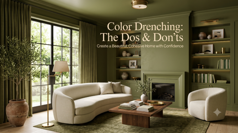
Paint the Wall Trim in the same sage tone for a subtle Color Drenching effect that minimizes visual breaks and makes compact rooms feel larger and more cohesive.
Olive Green
Olive Green is one of the most elegant Best Paint Colors for Small Rooms because it brings the calming beauty of nature indoors while adding depth and sophistication. Unlike brighter greens, olive has muted earthy undertones that make compact spaces feel cozy rather than crowded. It works beautifully in both classic and Modern Interior Design, making it a favorite among interior designers.
Why It Works
Olive Green creates subtle visual depth, allowing walls to feel more dimensional without overwhelming the room. Its balanced paint undertones pair well with natural materials like wood, stone, and linen, creating warm home styling that feels timeless. When paired with good Natural Light, olive green becomes one of the most stylish Paint Colors for Small Spaces.
Best Room
- Home office
- Reading nook
- Bedroom
- Small dining room
- Cozy living room
Best Finish
An Eggshell Finish is ideal because it provides a soft sheen while maintaining the richness of the color. For low-traffic rooms, Matte Paint creates a luxurious designer appearance.
Designer Tip
Pair olive green walls with soft white Ceiling Paint, oak furniture, brass hardware, cream textiles, and indoor plants. This combination enhances light reflection while creating a calming atmosphere inspired by nature.
Common Mistake to Avoid
Avoid pairing olive green with too many dark brown furniture pieces or heavy window treatments. Excessive dark elements can reduce visual space and make compact rooms feel heavier.
Earthy Terracotta
Earthy Terracotta has become one of today’s most popular Small Room Paint Colors because it introduces warmth, personality, and organic charm. Inspired by natural clay, this earthy shade creates inviting interiors that feel both modern and timeless.
Why It Works
Terracotta’s warm undertones add comfort without making small rooms feel enclosed. It complements natural textures, woven décor, and wooden furniture while creating balanced color psychology that encourages relaxation. It’s especially effective for homeowners looking beyond traditional neutral wall colors.
Best Room
- Bedroom
- Dining room
- Entryway
- Breakfast nook
- Kitchen feature wall
Best Finish
A Matte Paint finish emphasizes the earthy character of terracotta, while an Eggshell Finish provides extra durability for everyday living.
Designer Tip
Balance earthy terracotta with cream walls, natural wood furniture, black metal accents, linen fabrics, and woven baskets to achieve a contemporary Mediterranean-inspired look.
Common Mistake to Avoid
Avoid using terracotta on every wall in rooms with very little daylight. Instead, use it on one feature wall or balance it with lighter surrounding colors.
Warm Ochre
Warm Ochre is a cheerful, sophisticated shade that instantly brightens compact interiors. It has become one of the favorite Wall Colors for Small Rooms because it reflects warmth while maintaining openness.
Why It Works
Its golden undertones increase reflected light and help compensate for darker interiors with limited sunlight. Warm ochre also adds personality while preserving balanced room proportions, making small homes feel brighter and more welcoming.
Best Room
- Small kitchen
- Living room
- Hallway
- Studio apartment
- Children’s bedroom
Best Finish
A Satin Finish offers gentle reflectivity while remaining durable enough for high-traffic spaces.
Designer Tip
Pair warm ochre with soft white trim, light oak flooring, textured fabrics, matte black fixtures, and neutral décor for a cozy yet modern appearance.
Common Mistake to Avoid
Avoid combining warm ochre with bright yellow accessories, which can make the room appear overly vibrant instead of elegant.
Dusty Pink
Dusty Pink is a refined neutral with a subtle blush tone that creates softness without appearing overly feminine. It’s one of the most versatile Small Space Paint Ideas for homeowners seeking warmth and sophistication.
Why It Works
Its muted undertones gently reflect light while adding warmth and comfort. Dusty pink blends beautifully with gray, cream, brass, and natural wood, creating balanced interior styling that feels fresh yet timeless.
Best Room
- Bedroom
- Nursery
- Guest room
- Home office
- Dressing room
Best Finish
An Eggshell Finish provides a smooth appearance with just enough sheen to brighten compact spaces.
Designer Tip
Combine dusty pink walls with cream bedding, oak furniture, textured throws, brass lighting, and minimalist décor for an elegant modern aesthetic.
Common Mistake to Avoid
Avoid pairing dusty pink with overly bright or saturated pink accessories. Keeping surrounding décor muted creates a more sophisticated finish.
Charcoal Accent
A charcoal Accent Wall proves that dark colors can absolutely work in compact homes when used strategically. Instead of shrinking a room, charcoal often creates dramatic depth that expands visual perception.
Why It Works
Charcoal allows one wall to visually recede, increasing perceived room dimensions while creating an elegant focal point. It also enhances surrounding lighter walls through balanced color contrast, making it one of the smartest Paint Colors That Make a Room Look Bigger when used correctly.
Best Room
- Living room feature wall
- Bedroom behind the headboard
- Home office
- Dining room
- TV wall
Best Finish
A premium Matte Paint finish creates rich depth while minimizing glare.
Designer Tip
Balance charcoal with soft white walls, light flooring, mirrors, layered lighting, and warm wood furniture to maximize brightness and maintain openness.
Common Mistake to Avoid
Avoid painting every wall charcoal in rooms with limited natural sunlight. Without enough contrast, the room may feel enclosed rather than sophisticated.
Navy Blue
Navy Blue is a timeless designer favorite that adds elegance while surprisingly helping create greater visual depth. It’s one of the boldest Paint Colors for Small Spaces that still feels refined and welcoming.
Why It Works
Deep blue naturally makes walls appear farther away, enhancing visual space when balanced with white trim and good lighting. It also complements nearly every decorating style, from coastal to contemporary luxury.
Best Room
- Bedroom
- Dining room
- Home office
- Powder room
- Living room accent wall
Best Finish
An Eggshell Finish offers the perfect balance of durability and softness for walls, while Satin Finish works beautifully on cabinetry.
Designer Tip
Pair navy blue with brass lighting, white bedding, light wood flooring, oversized mirrors, and cream upholstery to brighten the overall space.
Common Mistake to Avoid
Avoid combining navy walls with dark flooring and black furniture throughout the room. Too many dark surfaces can reduce reflected light and make compact interiors feel smaller.
Rich Black (Used Strategically)
Rich Black may seem intimidating, but when used thoughtfully, it’s one of the most striking designer choices for compact homes. Strategic use of black creates contrast, elegance, and remarkable visual depth without overwhelming a room.
Why It Works
Black blurs architectural boundaries, allowing certain surfaces to visually disappear. Used on a single Accent Wall, built-in shelving, cabinetry, or Wall Trim, it creates dramatic contrast while emphasizing lighter surrounding walls. It’s also a popular choice for modern Color Drenching techniques.
Best Room
- Powder room
- Home office
- Library
- Fireplace wall
- Built-in shelving
- Interior doors
Best Finish
A premium Matte Paint finish delivers a luxurious appearance, while Gloss Paint is ideal for decorative trim, cabinetry, and statement furniture.
Designer Tip
Balance black with soft white walls, warm wood flooring, layered lighting, metallic finishes, and oversized mirrors. This combination maximizes light reflection while maintaining a bold designer look.
Common Mistake to Avoid
Never paint an entire small room black without abundant Natural Light, layered lighting, or contrasting finishes. Strategic placement creates sophistication, while excessive use can make compact spaces feel heavy and enclosed.
Olive Green
Olive Green is one of the most elegant Best Paint Colors for Small Rooms because it brings the calming beauty of nature indoors while adding depth and sophistication. Unlike brighter greens, olive has muted earthy undertones that make compact spaces feel cozy rather than crowded. It works beautifully in both classic and Modern Interior Design, making it a favorite among interior designers.
Why It Works
Olive Green creates subtle visual depth, allowing walls to feel more dimensional without overwhelming the room. Its balanced paint undertones pair well with natural materials like wood, stone, and linen, creating warm home styling that feels timeless. When paired with good Natural Light, olive green becomes one of the most stylish Paint Colors for Small Spaces.
Best Room
- Home office
- Reading nook
- Bedroom
- Small dining room
- Cozy living room
Best Finish
An Eggshell Finish is ideal because it provides a soft sheen while maintaining the richness of the color. For low-traffic rooms, Matte Paint creates a luxurious designer appearance.
Designer Tip
Pair olive green walls with soft white Ceiling Paint, oak furniture, brass hardware, cream textiles, and indoor plants. This combination enhances light reflection while creating a calming atmosphere inspired by nature.
Common Mistake to Avoid
Avoid pairing olive green with too many dark brown furniture pieces or heavy window treatments. Excessive dark elements can reduce visual space and make compact rooms feel heavier.
Earthy Terracotta
Earthy Terracotta has become one of today’s most popular Small Room Paint Colors because it introduces warmth, personality, and organic charm. Inspired by natural clay, this earthy shade creates inviting interiors that feel both modern and timeless.
Why It Works
Terracotta’s warm undertones add comfort without making small rooms feel enclosed. It complements natural textures, woven décor, and wooden furniture while creating balanced color psychology that encourages relaxation. It’s especially effective for homeowners looking beyond traditional neutral wall colors.
Best Room
- Bedroom
- Dining room
- Entryway
- Breakfast nook
- Kitchen feature wall
Best Finish
A Matte Paint finish emphasizes the earthy character of terracotta, while an Eggshell Finish provides extra durability for everyday living.
Designer Tip
Balance earthy terracotta with cream walls, natural wood furniture, black metal accents, linen fabrics, and woven baskets to achieve a contemporary Mediterranean-inspired look.
Common Mistake to Avoid
Avoid using terracotta on every wall in rooms with very little daylight. Instead, use it on one feature wall or balance it with lighter surrounding colors.
Warm Ochre
Warm Ochre is a cheerful, sophisticated shade that instantly brightens compact interiors. It has become one of the favorite Wall Colors for Small Rooms because it reflects warmth while maintaining openness.
Why It Works
Its golden undertones increase reflected light and help compensate for darker interiors with limited sunlight. Warm ochre also adds personality while preserving balanced room proportions, making small homes feel brighter and more welcoming.
Best Room
- Small kitchen
- Living room
- Hallway
- Studio apartment
- Children’s bedroom
Best Finish
A Satin Finish offers gentle reflectivity while remaining durable enough for high-traffic spaces.
Designer Tip
Pair warm ochre with soft white trim, light oak flooring, textured fabrics, matte black fixtures, and neutral décor for a cozy yet modern appearance.
Common Mistake to Avoid
Avoid combining warm ochre with bright yellow accessories, which can make the room appear overly vibrant instead of elegant.
Dusty Pink
Dusty Pink is a refined neutral with a subtle blush tone that creates softness without appearing overly feminine. It’s one of the most versatile Small Space Paint Ideas for homeowners seeking warmth and sophistication.
Why It Works
Its muted undertones gently reflect light while adding warmth and comfort. Dusty pink blends beautifully with gray, cream, brass, and natural wood, creating balanced interior styling that feels fresh yet timeless.
Best Room
- Bedroom
- Nursery
- Guest room
- Home office
- Dressing room
Best Finish
An Eggshell Finish provides a smooth appearance with just enough sheen to brighten compact spaces.
Designer Tip
Combine dusty pink walls with cream bedding, oak furniture, textured throws, brass lighting, and minimalist décor for an elegant modern aesthetic.
Common Mistake to Avoid
Avoid pairing dusty pink with overly bright or saturated pink accessories. Keeping surrounding décor muted creates a more sophisticated finish.
Charcoal Accent
A charcoal Accent Wall proves that dark colors can absolutely work in compact homes when used strategically. Instead of shrinking a room, charcoal often creates dramatic depth that expands visual perception.
Why It Works
Charcoal allows one wall to visually recede, increasing perceived room dimensions while creating an elegant focal point. It also enhances surrounding lighter walls through balanced color contrast, making it one of the smartest Paint Colors That Make a Room Look Bigger when used correctly.
Best Room
- Living room feature wall
- Bedroom behind the headboard
- Home office
- Dining room
- TV wall
Best Finish
A premium Matte Paint finish creates rich depth while minimizing glare.
Designer Tip
Balance charcoal with soft white walls, light flooring, mirrors, layered lighting, and warm wood furniture to maximize brightness and maintain openness.
Common Mistake to Avoid
Avoid painting every wall charcoal in rooms with limited natural sunlight. Without enough contrast, the room may feel enclosed rather than sophisticated.
Navy Blue
Navy Blue is a timeless designer favorite that adds elegance while surprisingly helping create greater visual depth. It’s one of the boldest Paint Colors for Small Spaces that still feels refined and welcoming.
Why It Works
Deep blue naturally makes walls appear farther away, enhancing visual space when balanced with white trim and good lighting. It also complements nearly every decorating style, from coastal to contemporary luxury.
Best Room
- Bedroom
- Dining room
- Home office
- Powder room
- Living room accent wall
Best Finish
An Eggshell Finish offers the perfect balance of durability and softness for walls, while Satin Finish works beautifully on cabinetry.
Designer Tip
Pair navy blue with brass lighting, white bedding, light wood flooring, oversized mirrors, and cream upholstery to brighten the overall space.
Common Mistake to Avoid
Avoid combining navy walls with dark flooring and black furniture throughout the room. Too many dark surfaces can reduce reflected light and make compact interiors feel smaller.
Rich Black (Used Strategically)
Rich Black may seem intimidating, but when used thoughtfully, it’s one of the most striking designer choices for compact homes. Strategic use of black creates contrast, elegance, and remarkable visual depth without overwhelming a room.
Why It Works
Black blurs architectural boundaries, allowing certain surfaces to visually disappear. Used on a single Accent Wall, built-in shelving, cabinetry, or Wall Trim, it creates dramatic contrast while emphasizing lighter surrounding walls. It’s also a popular choice for modern Color Drenching techniques.
Best Room
- Powder room
- Home office
- Library
- Fireplace wall
- Built-in shelving
- Interior doors
Best Finish
A premium Matte Paint finish delivers a luxurious appearance, while Gloss Paint is ideal for decorative trim, cabinetry, and statement furniture.
Designer Tip
Balance black with soft white walls, warm wood flooring, layered lighting, metallic finishes, and oversized mirrors. This combination maximizes light reflection while maintaining a bold designer look.
Common Mistake to Avoid
Never paint an entire small room black without abundant Natural Light, layered lighting, or contrasting finishes. Strategic placement creates sophistication, while excessive use can make compact spaces feel heavy and enclosed.
Paint Finishes That Work Best in Small Rooms
Choosing the right paint finish is just as important as selecting the Best Paint Colors for Small Rooms. Even the perfect wall color can lose its impact if it’s paired with the wrong finish. Different finishes influence light reflection, durability, maintenance, and the overall perception of visual space. Whether you’re decorating a cozy bedroom, a compact kitchen, or a tiny apartment, selecting the proper finish helps maximize brightness, improve room proportions, and create a polished Interior Design.
Matte Finish
Matte Paint is a designer favorite for creating smooth, sophisticated walls with minimal glare. Its soft, velvety appearance makes it ideal for modern home decor and cozy interiors.
Why It Works
Matte finishes absorb light rather than reflecting it, producing an elegant surface that hides imperfections exceptionally well. This seamless look minimizes visual distractions, helping compact spaces feel calm and refined. Matte is especially effective with neutral wall colors like soft white, warm cream, greige, and sage green.
Best For
- Living rooms
- Bedrooms
- Home offices
- Dining rooms
- Low-traffic spaces
Advantages
- Hides wall imperfections
- Creates a luxurious appearance
- Ideal for modern and Scandinavian Style interiors
- Excellent for creating cozy atmospheres
Limitations
- Less resistant to stains
- Harder to clean than shinier finishes
Designer Tip
Use Matte Paint on walls and pair it with satin or semi-gloss Wall Trim to create subtle depth without adding visual clutter.
Eggshell Finish
If you’re unsure which finish to choose, Eggshell Finish is often the safest and most versatile option for compact homes.
Why It Works
Its soft sheen reflects just enough light to brighten rooms while maintaining a smooth appearance. This balanced finish improves light reflection without exposing every wall imperfection, making it one of the best paint finishes for small rooms.
Best For
- Living rooms
- Bedrooms
- Hallways
- Dining rooms
- Small apartments
Advantages
- Easy to clean
- Soft elegant sheen
- Durable enough for everyday living
- Suitable for nearly every wall color
Limitations
- Can highlight poorly prepared walls if the surface isn’t smooth
Designer Tip
For most interior walls, Eggshell Finish provides the perfect combination of durability, elegance, and low maintenance.
Satin Finish
Satin Finish offers slightly more shine than eggshell while remaining practical for busy households.
Why It Works
The additional sheen reflects more light, helping darker rooms appear brighter. Satin also resists moisture, fingerprints, and everyday wear, making it ideal for active family homes and small house decor projects.
Best For
- Kitchens
- Bathrooms
- Children’s bedrooms
- Hallways
- Laundry rooms
Advantages
- Highly durable
- Moisture resistant
- Easy to wipe clean
- Enhances Natural Light
Limitations
- Reveals uneven wall texture more than matte finishes
Designer Tip
Pair satin walls with lighter Ceiling Paint and layered lighting to maximize brightness in compact spaces.
Gloss Finish (Where to Use It)
Gloss Paint provides the highest level of shine and reflectivity, but it works best when used selectively.
Why It Works
Because gloss reflects significant amounts of light, it draws attention to architectural features while increasing brightness. Rather than covering entire walls, designers typically reserve it for decorative elements that deserve emphasis.
Best For
- Wall Trim
- Interior doors
- Built-in shelving
- Cabinets
- Window frames
Advantages
- Extremely durable
- Highly washable
- Creates striking contrast
- Maximizes reflected light
Limitations
- Highlights every surface imperfection
- Can create unwanted glare on large walls
Designer Tip
Combine matte or eggshell walls with gloss trim to create a professional, high-end finish that feels elegant without overwhelming the room.
Designer Tricks That Make Small Rooms Look Bigger with Paint
Professional designers rely on much more than beautiful paint colors to transform compact homes. Strategic paint placement can dramatically improve visual space, enhance room proportions, and create the illusion of larger interiors. These expert techniques work beautifully alongside the Best Paint Colors for Small Rooms, helping every square foot feel brighter, more spacious, and carefully designed.
Paint the Ceiling
Many homeowners automatically paint ceilings bright white, but that’s not always the most effective strategy.
Why It Works
Using coordinated Ceiling Paint—either matching the walls or choosing a shade one tone lighter—creates a seamless transition that draws the eye upward. This reduces harsh visual breaks and makes ceilings appear noticeably higher.
Designer Tip
In compact bedrooms and living rooms, painting both the walls and ceiling the same soft neutral creates an elegant, uninterrupted appearance that visually expands the room.
Common Mistake
Avoid pairing very dark walls with stark white ceilings unless the contrast is intentional, as it can make ceilings appear lower.
Use One Continuous Color
One of the simplest ways to make a home feel larger is by reducing visual interruptions.
Why It Works
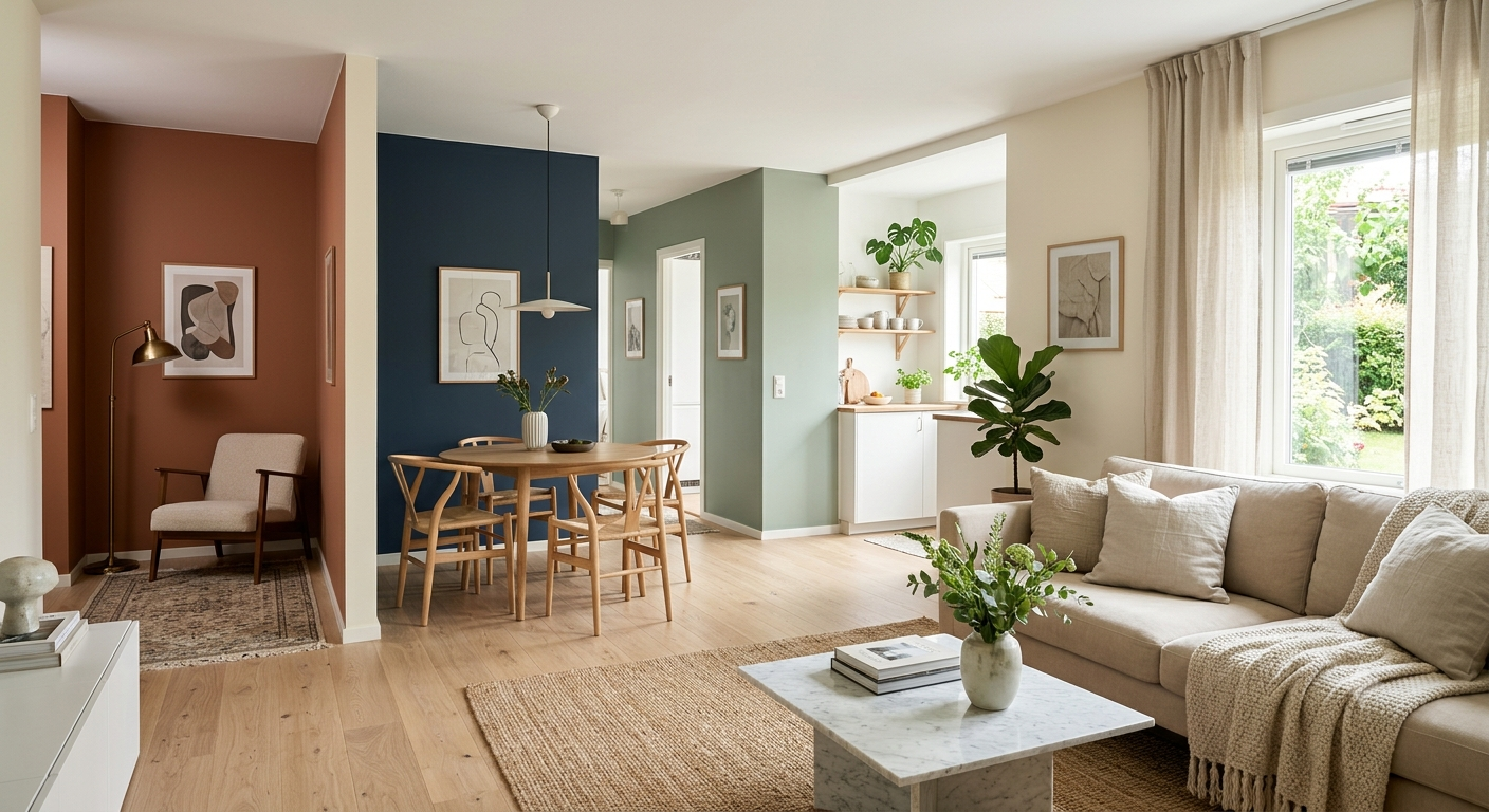
Using the same paint color throughout connected spaces creates continuous flow, allowing the eye to travel naturally from one room to another. This technique is especially effective in apartments, open-plan layouts, and smaller homes.
Designer Tip
Carry one neutral paint color through hallways, living rooms, and dining spaces to create a unified look that feels significantly larger.
Common Mistake
Switching colors in every room can visually divide the home and make compact layouts feel smaller than they actually are.
Try Color Drenching
Color Drenching has become one of the biggest paint trends in modern Interior Design, and it works exceptionally well in smaller spaces.
Why It Works
Instead of painting only the walls, color drenching extends the same shade across walls, ceilings, Wall Trim, doors, and sometimes cabinetry. Eliminating strong color contrast blurs architectural boundaries, increasing perceived size while creating a luxurious designer finish.
Designer Tip
Choose muted shades such as sage green, warm greige, dusty blue, or soft beige for a timeless color-drenched look.
Common Mistake
Avoid using extremely dark shades throughout rooms with very limited Natural Light, as the space may feel enclosed.
Paint Trim the Same Color
Traditional white trim isn’t always the best solution for compact interiors.
Why It Works
Painting the Wall Trim the same color as the walls reduces visual interruptions and creates smoother transitions throughout the room. This simple technique enhances visual depth while making walls appear taller and more continuous.
Designer Tip
This method works particularly well with soft whites, warm creams, greige, and muted greens.
Common Mistake
Using multiple trim colors in one room creates unnecessary visual clutter and distracts from the overall design.
Create an Accent Wall Carefully
A thoughtfully designed Accent Wall can add personality while preserving spaciousness.
Why It Works
One carefully placed accent wall creates a focal point that adds depth without overwhelming the room. Deep navy, charcoal, olive green, or earthy terracotta can make a wall visually recede, improving room proportions while enhancing the overall color palette.
Designer Tip
Place your accent wall behind the bed, fireplace, dining table, or television to naturally anchor the room.
Common Mistake
Using multiple accent walls or selecting unrelated colors can make small rooms appear fragmented rather than larger.
Pair Paint with Mirrors
Even the Best Paint Colors for Small Rooms become more effective when paired with strategically placed mirrors.
Why It Works
Mirrors amplify both Natural Light and artificial lighting by reflecting it throughout the room. This increases brightness, enhances light reflection, and creates the illusion of greater depth. When combined with soft wall colors and thoughtful paint placement, mirrors become one of the easiest ways to make compact spaces feel open and airy.
Designer Tip
Place a large mirror opposite a window to maximize daylight and brighten the entire room. Pair it with light-colored walls, layered lighting, and minimal window treatments for the strongest effect.
Common Mistake
Using several small mirrors instead of one large statement mirror often creates unnecessary visual clutter. A single oversized mirror usually provides a much stronger sense of openness and elegance.
Paint Color Mistakes to Avoid
Even after choosing the Best Paint Colors for Small Rooms, simple mistakes can prevent your space from reaching its full potential. Paint color is only one part of the equation—paint undertones, Natural Light, the right paint finish, and thoughtful paint placement all influence how spacious a room feels. By avoiding the following mistakes, you can improve visual space, maintain balanced room proportions, and achieve a professional-looking room makeover without spending thousands on renovations.
Using Very Bright White Everywhere
Bright white is often considered the safest option, but covering every wall, ceiling, and trim with stark white can actually make a room feel cold and uninviting.
Why It’s a Mistake
Pure white reflects a large amount of light, but without warm undertones it can create harsh contrast, especially under artificial lighting. Instead of making a room feel larger, it may emphasize empty spaces and make interiors appear flat or sterile.
Better Alternative
Choose soft white, warm cream, or ivory tones that provide excellent light reflection while adding warmth and comfort.
Designer Tip
Pair soft white walls with natural wood furniture, textured fabrics, and warm metallic accents for timeless home styling inspired by Scandinavian Style.
Ignoring Undertones
One of the biggest decorating mistakes is selecting paint based solely on the color sample without considering its undertones.
Why It’s a Mistake
Every paint color contains hidden paint undertones. Gray may appear blue, beige can lean pink, and white might look yellow or green depending on surrounding finishes and lighting. Ignoring undertones often results in colors that clash with flooring, cabinets, furniture, or countertops.
Better Alternative
Always compare paint samples alongside your existing flooring, countertops, upholstery, and décor before making a final decision.
Designer Tip
View paint samples during morning, afternoon, and evening light to understand how undertones change throughout the day.
Too Many Accent Walls
A carefully designed Accent Wall adds personality, but too many can overwhelm compact interiors.
Why It’s a Mistake
Multiple accent walls divide the room into smaller visual sections, interrupting the eye and reducing the sense of openness. Excessive contrast can make compact spaces feel cluttered rather than spacious.
Better Alternative
Choose one focal wall behind a bed, fireplace, dining table, or television. A single well-placed accent wall creates depth without disrupting visual flow.
Designer Tip
Select an accent color that complements your main wall color instead of competing with it for a more cohesive design.
Choosing the Wrong Paint Finish
Even the perfect color can disappoint if paired with the wrong finish.
Why It’s a Mistake
Using Gloss Paint on large walls can highlight every imperfection, while Matte Paint may not perform well in moisture-prone areas like kitchens and bathrooms. Choosing the wrong finish affects durability, maintenance, and the overall appearance of your walls.
Better Alternative
Choose finishes based on room function:
- Matte Paint: Bedrooms, living rooms, home offices
- Eggshell Finish: Most interior walls
- Satin Finish: Kitchens, bathrooms, hallways
- Gloss Paint: Doors, cabinets, Wall Trim, and decorative details
Designer Tip
Mix finishes within the same room for subtle contrast—for example, matte walls paired with satin trim.
Ignoring Natural Light
Lighting dramatically changes the way every paint color appears.
Why It’s a Mistake
A color that looks beautiful in a showroom may appear completely different in your home because of Natural Light, room orientation, and artificial lighting. Ignoring these factors often leads to disappointing results after the painting is complete.
Better Alternative
Evaluate paint colors under daylight and evening lighting before making your final decision.
Designer Tip
For north-facing rooms with cooler light, choose warmer shades like cream, greige, or warm beige to maintain a welcoming atmosphere.
Choosing Color Before Testing Samples
Skipping paint samples is one of the costliest mistakes homeowners make.
Why It’s a Mistake
Small paint chips rarely show how a color behaves across an entire wall. Lighting, paint undertones, ceiling height, surrounding décor, and room size all affect the final appearance.
Better Alternative
Purchase sample pots and paint large sections on different walls. Observe them for several days under changing weather and lighting conditions before committing.
Designer Tip
Testing colors is especially important when choosing bold shades like navy, olive green, charcoal, or earthy terracotta, as they can appear dramatically different depending on light exposure.
Quick Paint Color Comparison Table
Choosing the right shade becomes much easier when you compare colors side by side. The table below highlights some of the Best Paint Colors for Small Rooms, along with their ideal applications, recommended finishes, and decorating styles. Use it as a quick reference when planning your next room makeover.
| Paint Color | Best Room | Best Finish | Style |
| Soft White | Living Room | Matte Paint | Scandinavian |
| Warm Cream | Bedroom | Eggshell Finish | Classic |
| Sage Green | Home Office | Matte Paint | Modern |
| Navy Blue | Accent Wall | Satin Finish | Luxury |
| Light Greige | Dining Room | Eggshell Finish | Contemporary |
| Earthy Terracotta | Bedroom | Matte Paint | Rustic |
Quick Designer Recommendation
- For maximum brightness: Soft White or Warm Cream.
- For modern elegance: Light Greige or Sage Green.
- For bold sophistication: Navy Blue as an Accent Wall.
- For cozy interiors: Earthy Terracotta with natural wood textures.
- For the most versatile finish: Eggshell Finish works beautifully in most living spaces, while Matte Paint creates a luxurious look in bedrooms and living rooms.
When combined with the right Ceiling Paint, coordinated Wall Trim, balanced lighting, and thoughtful interior styling, these colors can dramatically improve visual space, making even the smallest home feel brighter, more open, and effortlessly stylish.
Frequently Asked Questions
What paint color makes a small room look bigger?
The Best Paint Colors for Small Rooms are shades that reflect light and create the illusion of more space. Soft white, warm cream, light greige, pale sage green, and sky blue are among the most effective choices because they maximize light reflection and make walls appear farther apart. If your room has limited Natural Light, warm neutrals usually perform better than cool whites. The key is choosing a color that complements your room’s lighting and existing décor rather than simply selecting the lightest shade available.
Should small rooms always be painted white?
No. While white is a timeless option, small rooms don’t always need to be painted white. Many interior designers prefer warm cream, greige, soft beige, sage green, or muted blue because these shades add personality while still making compact spaces feel open. The best wall color depends on your room’s lighting, furniture, and decorating style. Soft neutral colors often create a warmer and more inviting atmosphere than stark white.
Can dark paint colors work in compact spaces?
Absolutely. Dark paint colors can work beautifully in small spaces when used strategically. Navy blue, charcoal, olive green, and even rich black can add elegance and create impressive visual depth. Instead of making a room feel smaller, darker shades can cause walls to visually recede when balanced with lighter Ceiling Paint, coordinated Wall Trim, mirrors, and layered lighting.
For the best results:
- Use one Accent Wall rather than painting every wall dark.
- Pair dark walls with light-colored furniture and décor.
- Maximize both natural and artificial lighting.
- Add mirrors to increase reflected light.
- Keep the overall color palette balanced.
What is the best neutral paint color for small rooms?
The best neutral paint color depends on your lighting and design style, but these designer favorites consistently perform well:
- Soft White: Bright, clean, and versatile.
- Warm Cream: Cozy and welcoming.
- Light Greige: Modern and sophisticated.
- Soft Beige: Timeless and flexible.
- Sage Green: A nature-inspired neutral with subtle color.
These shades remain among the Best Paint Colors for Small Rooms because they complement almost every decorating style while helping compact interiors feel brighter and more spacious.
Which paint finish is best for small rooms?
Choosing the correct paint finish is just as important as selecting the right color.
- Matte Paint: Best for bedrooms, living rooms, and home offices.
- Eggshell Finish: Ideal for most interior walls because it balances durability with a soft sheen.
- Satin Finish: Excellent for kitchens, bathrooms, and high-traffic areas.
- Gloss Paint: Best reserved for doors, cabinets, and decorative trim.
For most homeowners, Eggshell Finish provides the ideal combination of elegance, durability, and gentle light reflection, making it one of the best paint finishes for small rooms.
Should ceilings be painted the same color as walls?
In many cases, yes. Matching the Ceiling Paint to the wall color—or using a shade just one tone lighter—creates a seamless transition that makes ceilings appear higher. This technique reduces visual interruptions and improves room proportions, making compact rooms feel larger.
However, rooms with extremely low ceilings may still benefit from a slightly lighter ceiling color to emphasize height. The best choice depends on ceiling height, lighting, and your overall Interior Design style.
Should trim be painted the same color as the walls?
Painting Wall Trim the same color as the walls has become a popular designer technique, especially in compact homes. This approach minimizes visual breaks and allows the eye to move smoothly around the room, creating the illusion of more space.
If you prefer a more traditional appearance, choose trim that’s only one shade lighter than the walls instead of bright white. This softer contrast keeps the room feeling cohesive while still highlighting architectural details.
What colors reflect the most light?
Colors with high light reflectance naturally make rooms appear brighter and more open. Some of the best options include:
- Soft White
- Warm Cream
- Ivory
- Light Greige
- Pale Beige
- Sky Blue
- Soft Sage Green
These colors maximize light reflection, making them excellent choices for paint colors that make a room look bigger, particularly in apartments and smaller homes.
Can dark colors make a small room look elegant?
Yes. Dark colors are often associated with luxury and sophistication. Deep navy, charcoal, olive green, and rich black can create a dramatic designer look without overwhelming compact spaces when paired with good lighting, lighter furnishings, and a balanced color palette.
The key is moderation. Using darker shades on one feature wall or through Color Drenching in a well-lit room creates a bold yet refined appearance.
How do designers choose paint colors for small homes?
Professional designers rarely choose paint based on color alone. Instead, they evaluate several factors before making a recommendation:
- Amount of Natural Light
- Room orientation
- Existing flooring and furniture
- Paint undertones
- Desired mood and color psychology
- Ceiling height and room proportions
- Preferred decorating style
- Appropriate paint finish
By considering all of these elements together, designers create spaces that feel brighter, more cohesive, and visually larger without major renovations.
Conclusion
Selecting the Best Paint Colors for Small Rooms is one of the simplest yet most effective ways to transform a compact home. The right combination of wall color, paint finish, lighting, and thoughtful paint placement can dramatically improve visual space, enhance room proportions, and make even the smallest room feel brighter, more open, and beautifully designed. Whether you prefer timeless neutrals like soft white and warm cream or bold statement shades like navy blue, olive green, and earthy terracotta, every color has the potential to elevate your home when used strategically.
Remember that paint is only part of the design equation. Choosing the right Matte Paint, Eggshell Finish, Satin Finish, or Gloss Paint, coordinating your Ceiling Paint and Wall Trim, incorporating techniques like Color Drenching or a carefully placed Accent Wall, and maximizing both natural and artificial lighting all contribute to a successful room makeover. These professional design techniques help create greater visual depth, improve light reflection, and achieve a polished look without expensive renovations.
Before committing to any paint color, always purchase sample pots and test them on multiple walls. Observe how the colors change throughout the day under different lighting conditions, paying close attention to paint undertones and how they interact with your flooring, furniture, and décor. This small investment of time can prevent costly mistakes and ensure you’re completely satisfied with the final result.
No matter the size of your home, thoughtful color choices can make a remarkable difference. With the designer-approved ideas, paint techniques, and expert tips shared in this guide, you can confidently create a home that feels brighter, more spacious, stylish, and welcoming. Sometimes, all it takes is the perfect paint color to completely transform the way you experience your space.
FAQs
What Color Is Best for Small Houses?
When decorating a compact home, choosing the right paint color can make a dramatic difference. The Best Paint Colors for Small Rooms and small houses are typically light, neutral shades that maximize light reflection and create the illusion of more space. Soft White, Warm Cream, Light Greige, Sage Green, and Sky Blue are among the top designer recommendations because they brighten interiors while maintaining a warm and welcoming atmosphere.
If your home receives limited Natural Light, choose warm neutrals like cream or greige instead of stark white. These shades prevent rooms from feeling cold while making compact spaces appear larger and more inviting.
Which 3 Color Combination Is Best?
The best three-color combinations create balance, contrast, and visual harmony without overwhelming a small room. Here are a few designer-approved palettes:
- Soft White + Sage Green + Natural Oak – Perfect for Scandinavian and modern interiors.
- Warm Cream + Light Greige + Matte Black Accents – Creates a timeless contemporary look.
- Sky Blue + Soft White + Light Wood – Bright, airy, and ideal for coastal-inspired homes.
Keeping your color palette simple helps improve room proportions, enhances home styling, and creates a more spacious appearance.
What Is the Best Color to Paint a Small House?
The best color to paint a small house is Soft White because it reflects the most light and creates an open, airy feeling. However, Warm Cream, Soft Beige, Light Greige, and Sage Green are also excellent choices for homeowners who want warmth and personality without making rooms feel smaller.
Remember that the best color depends on your home’s lighting, existing décor, and overall Interior Design style. Testing paint samples before painting is always recommended to ensure the color works well in your space.
What Is the Best Paint Color for a Small Living Space?
The best paint colors for a small living space are shades that maximize brightness while creating a comfortable atmosphere. Some of the top choices include:
- Soft White
- Warm Cream
- Light Greige
- Soft Beige
- Sage Green
- Sky Blue
These colors improve visual space, reflect both natural and artificial lighting, and pair beautifully with modern furniture and minimalist décor. Adding mirrors and layered lighting further enhances the spacious effect.
What Is the Most Relaxing Paint Color?
If you want to create a calm and peaceful environment, Sage Green is one of the most relaxing paint colors according to interior designers. Its soft, nature-inspired tone promotes relaxation while adding subtle sophistication.
Other relaxing colors include Warm Cream, Soft Beige, Sky Blue, and Olive Green. These shades use balanced color psychology to create cozy, inviting interiors, making them ideal for bedrooms, reading nooks, and quiet living spaces.
What Colors Make Small Rooms Look Bigger?
The colors that make small rooms look bigger are those with high light reflectance and soft undertones. The best options include Soft White, Warm Cream, Light Greige, Soft Beige, Sky Blue, and Sage Green. These colors blur visual boundaries, increase light reflection, and make walls appear farther apart.
For even better results, pair these colors with matching Ceiling Paint, coordinated Wall Trim, a carefully placed Accent Wall, mirrors, and layered lighting. Together, these designer techniques create the illusion of a brighter, larger, and more open home.