Color Drenching: The Dos and Don’ts of This Beautiful Trend
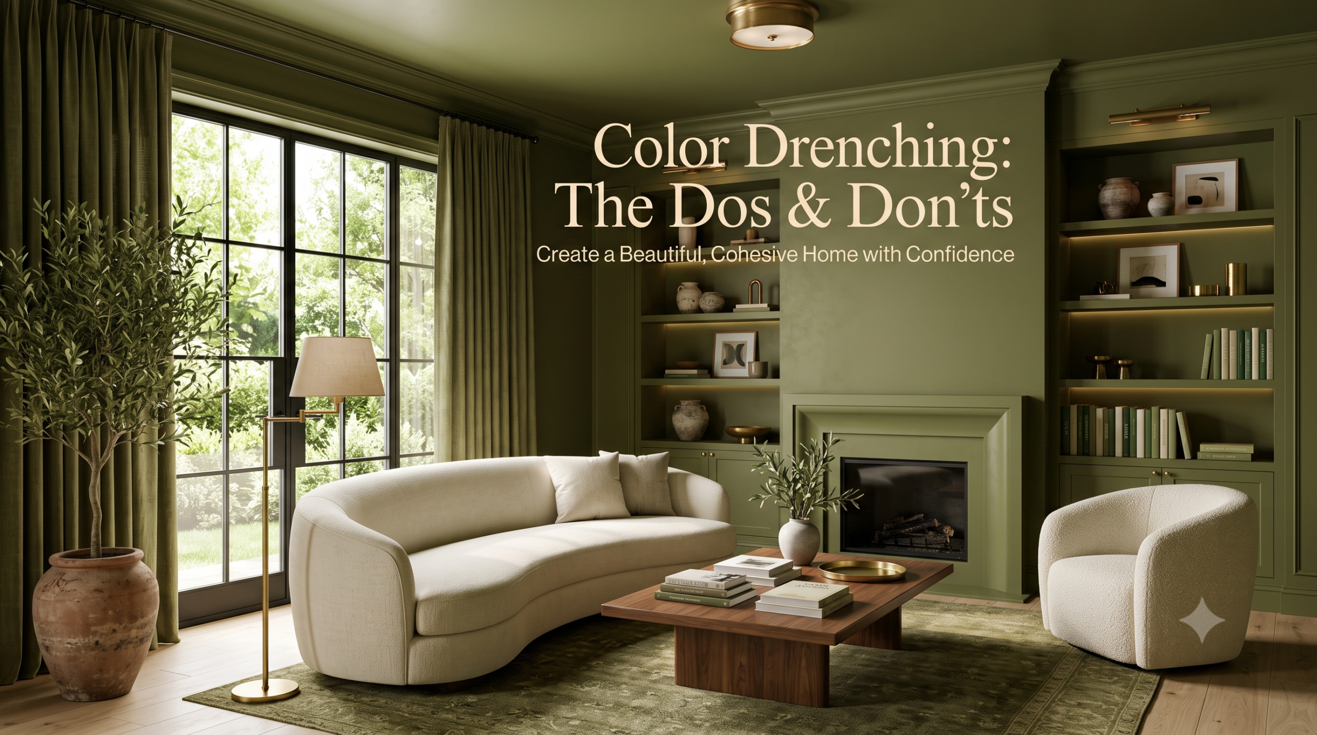
If you’ve been browsing Pinterest, Instagram, or the latest interior design magazines, you’ve probably noticed a growing trend that’s taking over modern homes: color drenching. Unlike traditional decorating, where walls, trim, and ceilings are painted in contrasting shades, color drenching creates a seamless, immersive environment by covering nearly every visible surface in the same color or closely related tones.
The result is a sophisticated, cohesive space that feels intentional, luxurious, and surprisingly calming. Whether you love earthy neutrals, dramatic jewel tones, or soft pastels, color drenching can transform any room when done correctly.
However, like every design trend, there are right and wrong ways to embrace it. This guide explores the dos and don’ts of color drenching, helping you achieve a timeless look rather than one you’ll regret.
What Is Color Drenching?
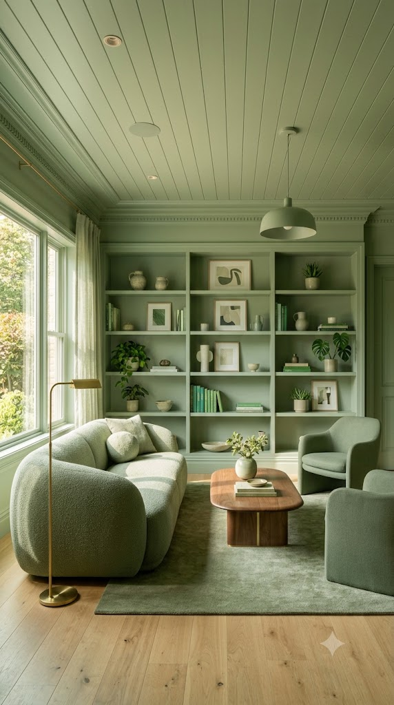
Color drenching is an interior design technique where one paint color is used across multiple surfaces, including:
- Walls
- Ceiling
- Trim
- Doors
- Built-in shelving
- Window frames
- Sometimes even furniture
Instead of creating contrast, this approach creates visual continuity, making a room feel more cohesive and architecturally refined.
Designers often use different paint finishes—such as matte on walls and satin on trim—to subtly distinguish surfaces while maintaining a unified appearance.
Why Color Drenching Has Become So Popular
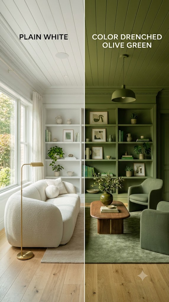
Several reasons explain why homeowners and interior designers are embracing this trend.
Creates Visual Harmony
Using one dominant color removes visual interruptions, allowing the architecture and furnishings to shine naturally.
Makes Small Rooms Feel Larger
Contrary to popular belief, color drenching often makes compact spaces feel bigger because there are fewer visual breaks.
Adds Luxury
Many high-end hotels, boutique spaces, and designer homes use monochromatic color schemes because they create an elegant, curated atmosphere.
Highlights Texture Instead of Contrast
Instead of relying on multiple colors, color drenching emphasizes:
- Wood grain
- Fabric texture
- Stone surfaces
- Decorative molding
- Architectural details
The Dos of Color Drenching
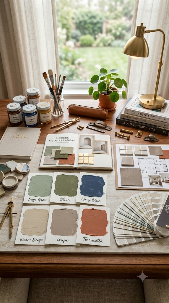
1. Choose the Right Color for the Room
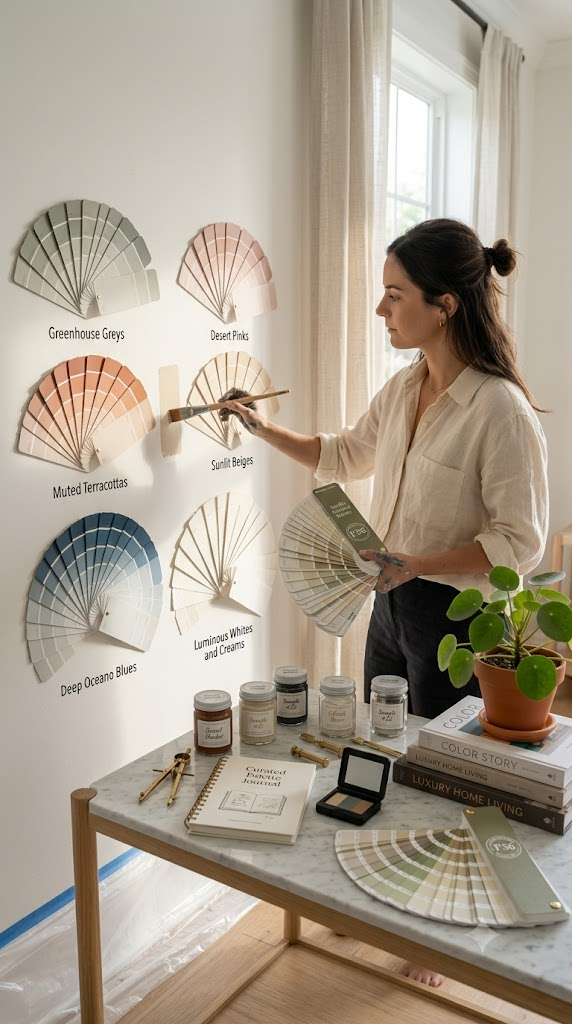
Not every paint color works equally well.
Some of the most successful choices include:
- Warm taupe
- Olive green
- Sage
- Dusty blue
- Soft terracotta
- Charcoal
- Deep navy
- Rich forest green
- Warm cream
Think about how the room is used before selecting a shade.
For example:
- Bedrooms benefit from calming colors.
- Dining rooms can handle richer tones.
- Home offices often work well with muted greens or blues.
2. Test Paint Samples First
Lighting dramatically changes paint colors.
Always test several samples on different walls and observe them during:
- Morning light
- Afternoon sun
- Evening lighting
- Artificial lighting
This simple step prevents costly repainting later.
3. Paint the Ceiling Too
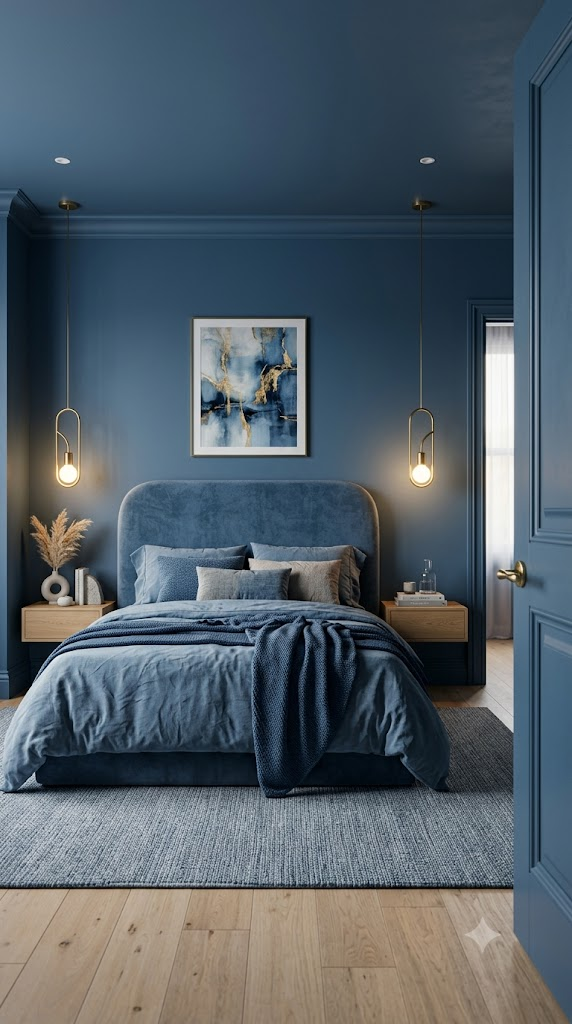
One defining feature of authentic color drenching is extending the color onto the ceiling.
This creates:
- Better visual flow
- Greater depth
- A cozy atmosphere
- Stronger architectural impact
Leaving the ceiling white often interrupts the immersive effect.
4. Include Trim and Doors
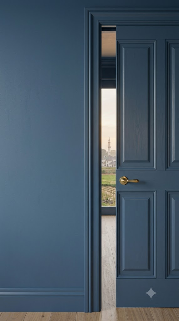
Traditional white trim creates sharp contrast.
Color drenching works best when these elements are painted in the same color as the walls.
Instead of contrast, use different paint finishes:
- Matte walls
- Satin trim
- Semi-gloss doors
This subtle variation adds depth while maintaining cohesion.
5. Layer Different Textures
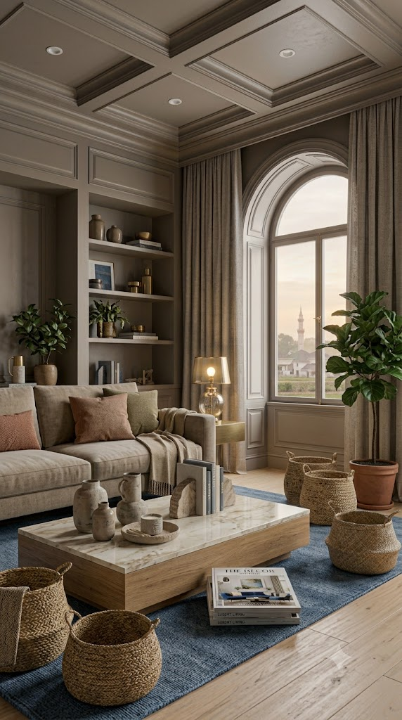
When using one dominant color, texture becomes incredibly important.
Mix materials such as:
- Velvet
- Linen
- Bouclé
- Natural wood
- Leather
- Stone
- Woven baskets
- Metal accents
Texture keeps monochromatic rooms visually interesting.
6. Balance with Natural Materials
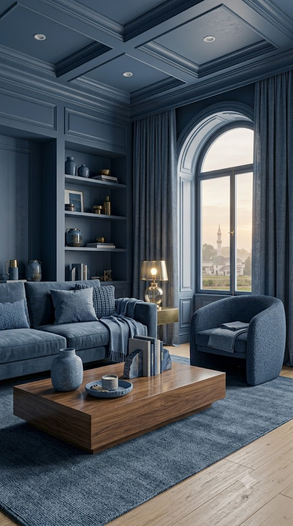
Natural finishes prevent color-drenched rooms from feeling overwhelming.
Great additions include:
- Oak furniture
- Walnut tables
- Marble surfaces
- Rattan lighting
- Indoor plants
- Woven rugs
These elements soften the overall appearance.
7. Use Good Lighting

Lighting completely changes how color drenching feels.
Layer multiple light sources:
- Ceiling lights
- Wall sconces
- Table lamps
- Floor lamps
- Accent lighting
Warm lighting often complements rich paint colors better than cool white bulbs.
The Don’ts of Color Drenching
1. Don’t Ignore Natural Light
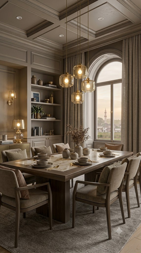
A dark color may look beautiful online but appear nearly black in a room with limited sunlight.
Rooms with little natural light often perform better with:
- Warm beige
- Soft green
- Dusty blue
- Light taupe
- Warm white
Always consider your room’s orientation before choosing paint.
2. Don’t Forget About Furniture
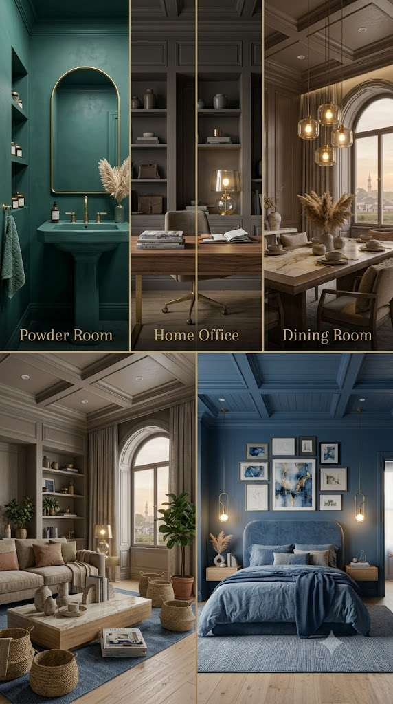
Your walls aren’t the only part of the design.
Furniture should complement the color palette rather than compete with it.
Choose pieces that:
- Blend naturally
- Add texture
- Introduce subtle contrast
- Create visual balance
3. Don’t Use Too Many Accent Colors
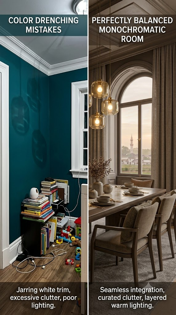
One of the biggest mistakes is introducing several competing colors.
Instead, keep accent colors minimal.
A monochromatic room usually benefits from:
- Black accents
- Brass finishes
- Warm wood
- Cream textiles
This preserves the calming effect.
4. Don’t Skip Paint Finish Selection
Even when using one color, paint finish matters.
A common combination is:
| Surface | Finish |
|---|---|
| Walls | Matte |
| Ceiling | Matte |
| Trim | Satin |
| Doors | Semi-gloss |
These finish variations add subtle dimension.
5. Don’t Overdecorate
Color drenching already creates a bold visual statement.
Avoid cluttering the room with:
- Excess artwork
- Busy patterns
- Numerous decorative accessories
- Too many contrasting colors
Minimal styling usually looks more sophisticated.
6. Don’t Ignore Undertones
Paint colors have undertones that affect the entire room.
Examples include:
- Warm beige
- Cool gray
- Yellow undertones
- Pink undertones
- Green undertones
Always compare samples side by side before making a final decision.
7. Don’t Copy Social Media Without Adapting It
Pinterest inspiration is wonderful—but every home has different:
- Lighting
- Ceiling height
- Flooring
- Window size
- Architecture
Customize the trend to fit your own space rather than copying a photo exactly.
Best Rooms for Color Drenching
Not every room responds the same way.
Living Room
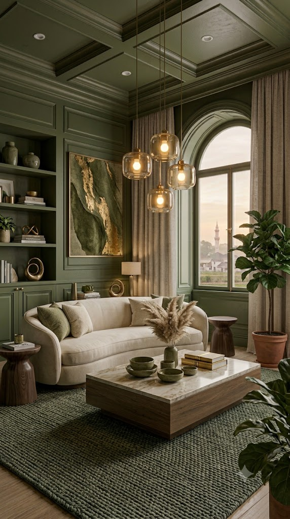
A color-drenched living room feels warm, inviting, and luxurious.
Popular colors include:
- Olive green
- Warm greige
- Deep blue
- Chocolate brown
Bedroom
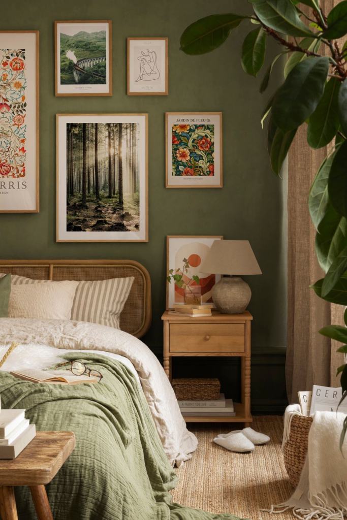
Bedrooms benefit enormously from immersive colors because they promote relaxation.
Excellent choices include:
- Sage green
- Dusty blue
- Mauve
- Soft charcoal
- Warm taupe
Dining Room
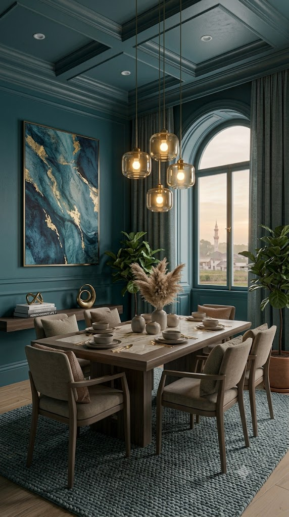
Dining spaces can embrace richer colors.
Popular options include:
- Burgundy
- Forest green
- Navy
- Espresso brown
These shades create an intimate atmosphere.
Home Office
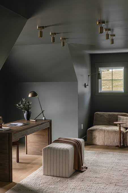
Color drenching helps reduce visual distractions.
Try:
- Muted green
- Blue-gray
- Warm clay
- Olive
These shades encourage focus.
Powder Room
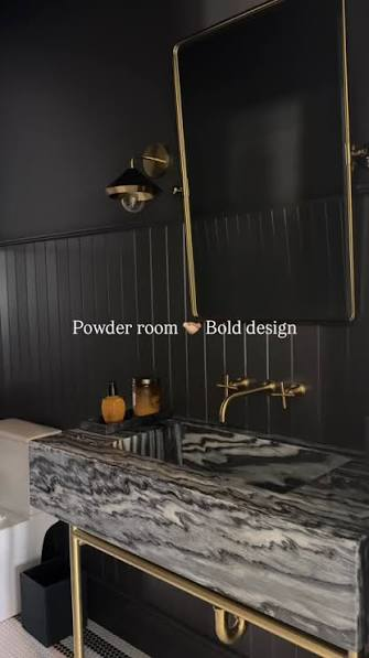
Small bathrooms are ideal places to experiment with bold colors.
Because the room is compact, dramatic shades feel intentional rather than overwhelming.
Best Colors for Color Drenching
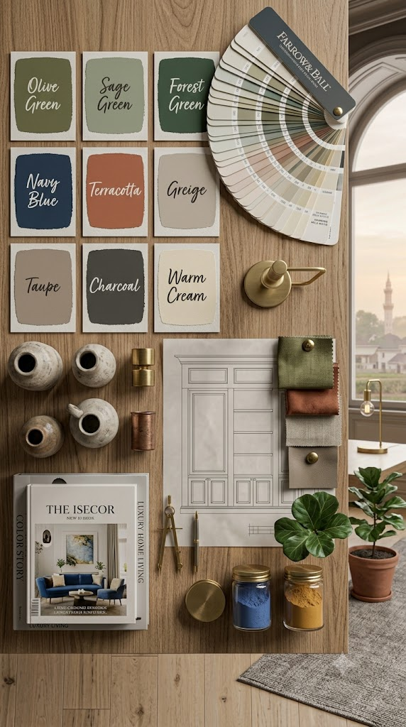
Some shades consistently produce beautiful results.
Earthy Neutrals
Perfect for timeless interiors.
Examples:
- Warm beige
- Mushroom
- Taupe
- Greige
Greens
Among today’s most popular choices.
Examples:
- Olive
- Sage
- Moss
- Forest green
Blues
Ideal for calming spaces.
Examples:
- Navy
- Slate blue
- Denim blue
- Dusty blue
Rich Jewel Tones
Create luxurious interiors.
Examples:
- Emerald
- Burgundy
- Aubergine
- Deep teal
Soft Pastels
Work beautifully in airy homes.
Examples:
- Blush
- Pale green
- Lavender
- Powder blue
Styling Tips for a Perfect Color-Drenched Room
To elevate the look further:
- Add oversized artwork with subtle colors.
- Use layered curtains in natural fabrics.
- Incorporate textured rugs.
- Mix vintage and modern furniture.
- Include indoor plants for freshness.
- Choose simple decorative accessories.
- Use mirrors to reflect light.
- Introduce metallic accents sparingly.
The goal is to let the color remain the star of the room.
Is Color Drenching Worth Trying?
Absolutely.
Unlike many short-lived decorating fads, color drenching is rooted in classic design principles. Monochromatic interiors have existed for decades in luxury homes because they emphasize proportion, texture, and craftsmanship rather than relying on busy color combinations.
The trend is also incredibly versatile. Whether your style is modern, Scandinavian, traditional, contemporary, farmhouse, or minimalist, color drenching can be adapted to suit your home.
The secret lies in selecting the right paint color, paying attention to lighting, and balancing the space with natural materials and layered textures.
Final Thoughts
Color drenching is more than a passing interior design trend—it’s a sophisticated approach to creating calm, cohesive, and visually striking spaces. By painting walls, ceilings, trim, and architectural details in the same carefully chosen hue, you can make rooms feel larger, more elegant, and effortlessly curated.
Success comes from following the right principles: choose a color that suits the room, test paint samples in different lighting, embrace texture, and avoid clutter or too many competing accents. With thoughtful planning, color drenching can transform everything from cozy bedrooms to dramatic dining rooms into timeless spaces you’ll enjoy for years.
Whether you prefer soft neutrals, earthy greens, or bold jewel tones, this design technique offers endless possibilities for creating a home that feels both stylish and uniquely personal.